on
Stylin' and Profilin'
This assignment also stretched the boundaries of what I thought I knew about Jekyll blogs. Before this class, I didn’t even know that it was possible to customized the pre-made themes, however, this subverted all of my expectations. More importantly, however, I did not know that you could create new Markdown pages in the root directory to add pages to your header. Quite revolutionary indeed.
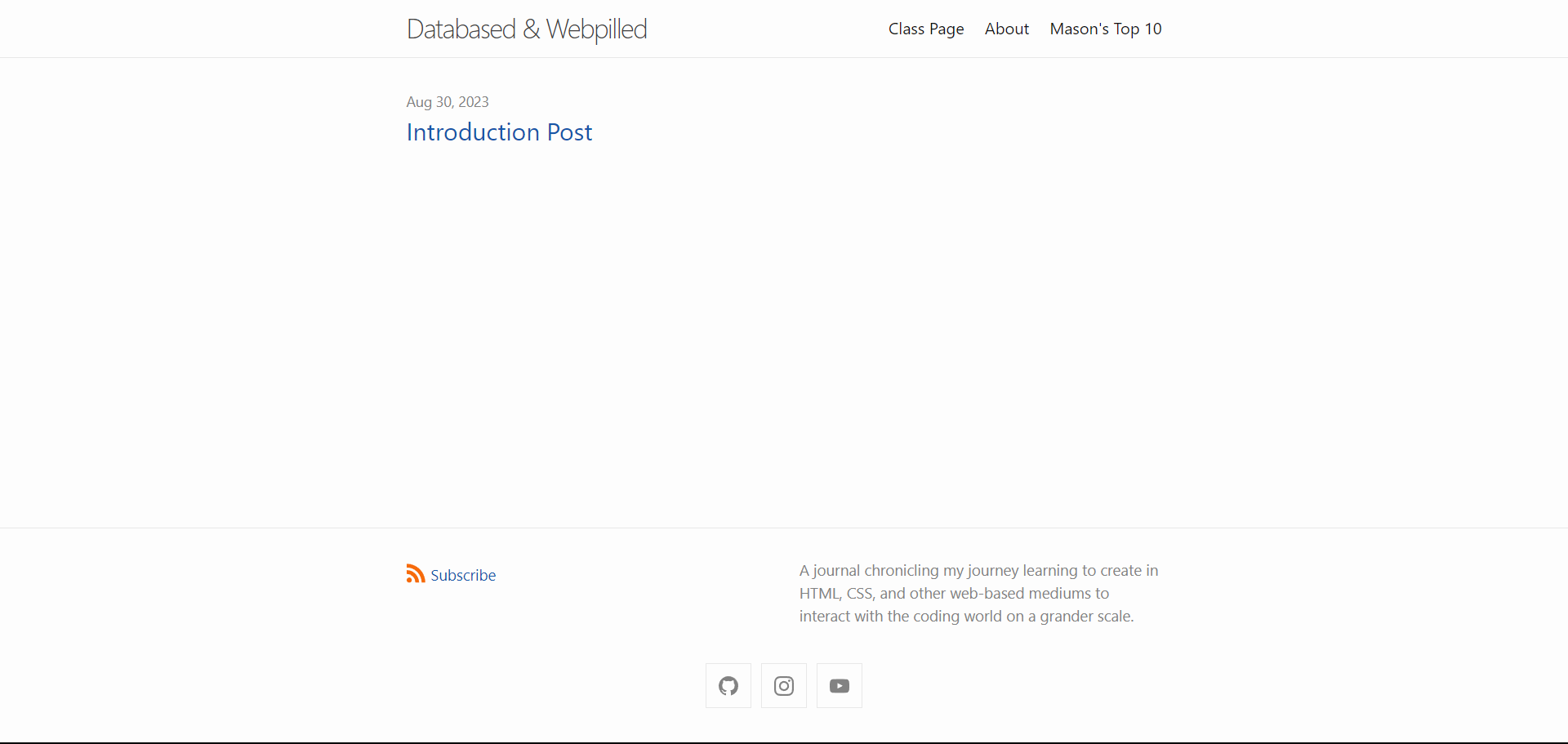
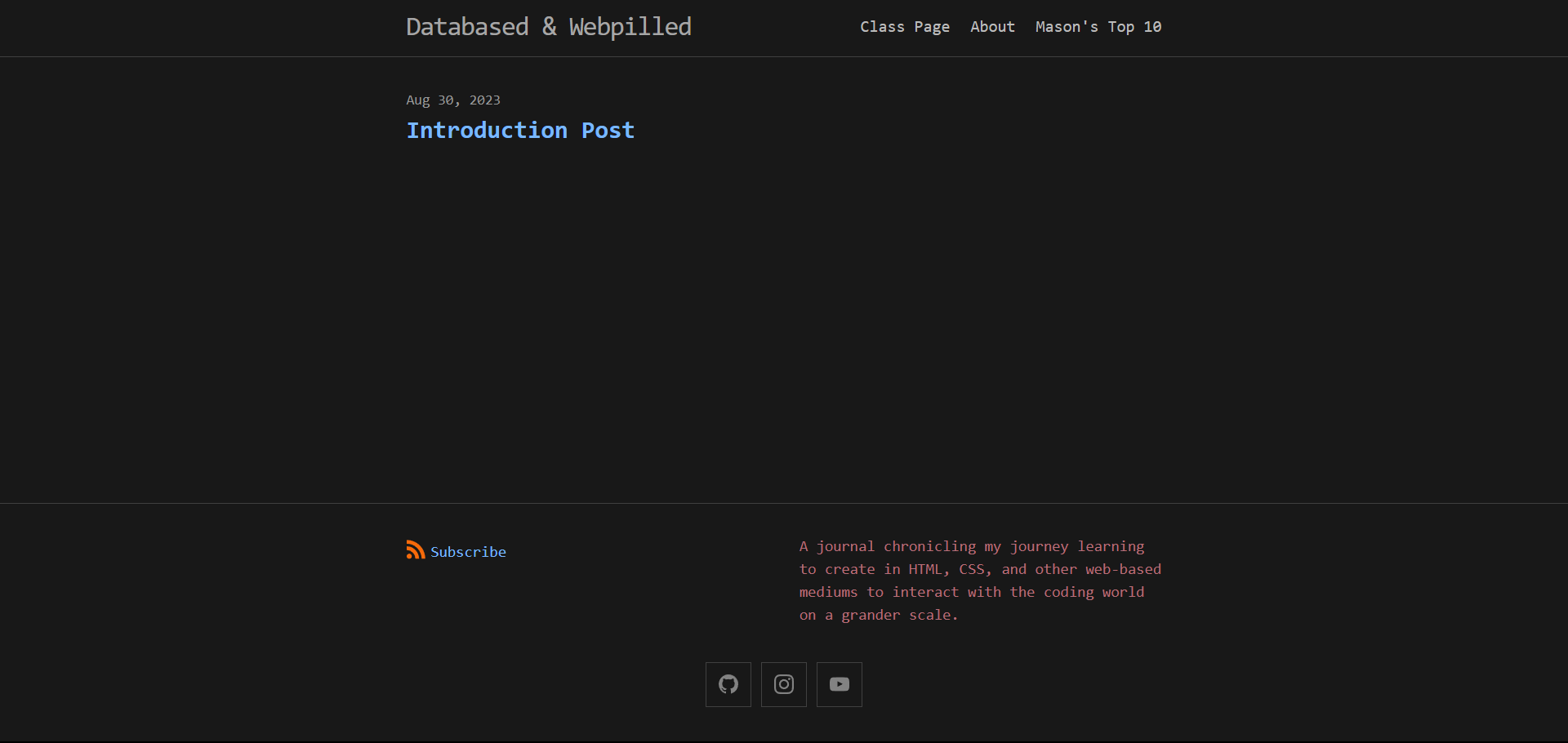
As you can see by the newer appearance of my blog, I have made an abundance of changes to fit my style a bit more. I’ve even included before and after pictures below…
Changes
BEFORE

AFTER

In total, the changes I made were:
- Changing the UI to be a dark theme.
- Changing all font colors to be a reddish-pink color.
- Changing the font to Monaco (it came with CSS).
Of course, my work today was not without many, many struggles, those of which are included but not limited to:
- Not knowing how to edit site.pages, only to find out that it isn’t something that is modified.
- The Jekyll documentation kept appearing in my header so I just moved it to a different folder.
- I tried adding a custom font called Mulish from Google but didn’t know how to implement it.
- I tried to make dark mode on my own before I found out that it is already implemented in Minima.
- I wanted to change the color of all hyperlinks/anchors to a lime green, but couldn’t figure out how to do so.
- I wanted a reversed list for my top 10, so I had to find out how to do so here.
Future
I’m excited to continue posting with this blog in the future. At some point I would like to make some more changes (I’m still not over the hyperlinks and the custom fonts), but for now I’m happy with what I have. Here’s to many more blogs and many more meme-able moments.